Principles of Web Development 2021-2023
Modern web development principles are built on logic, common sense, developer convenience, and business needs. Developers are not obliged to adhere to these principles, but if they do, it signifies a higher level of website quality.
Cross-Browser Compatibility
Browsers do not have a unified standard and can display the same element differently. The task of a developer is to test the website on all popular browsers such as Google Chrome, Yandex, Opera, Safari, Firefox, and Edge to ensure that the layout remains intact in each of them.
In some cases, vendor prefixes are used before new CSS properties to achieve cross-browser compatibility. For example, not all browsers may interpret the animation duration equally well. To address this issue, prefixes are added. This creates a separate property for a specific browser. Instead of using a normal transition-duration: 0.76s, we have:
-webkit-transition-duration: 0.76s; -moz-transition-duration: 0.76s; -o-transition-duration: 0.76s; -ms-transition-duration: 0.76s;
where webkit, moz, o, and ms are prefixes.
Essentially, this practice is considered undesirable as it contributes to bloating CSS files. Each non-standard and new property requires an additional four lines with all the prefixes.
This process can be automated using tools like Autoprefixer, which adds prefixes where necessary. You input a file without prefixes, and it outputs a file with prefixes.
However, there are properties that only work in specific browsers. In such cases, it is necessary to either avoid using them or use them with caution, especially if they significantly alter the appearance of elements.
Previously, ensuring correct display on older browser versions was a mandatory requirement for developers. Nowadays, this requirement is not as relevant because developing for older browsers significantly increases project costs, and the number of users using them is decreasing every year. Therefore, investing in development for these outdated browsers is not cost-effective. It is much more important for a website to display correctly on modern browsers.
The best way to test cross-browser compatibility is to download all popular browsers, visit the website, and observe how the layout behaves. However, to expedite the process, developers use specialized services. Some of them work on a scoring system, analyzing CSS and assigning a score to each property in a specific browser. For example, the service “Can I use” shows which CSS properties, technologies, font extensions, and image formats are supported by different browsers. The score is given as a percentage of users in browsers where the layout remains intact. Therefore, if the selection is a million people and the score on “Can I use” is 99%, it means that there will be 10,000 people with older browser versions who won’t see our design.


However, more modern platforms like Browserstack offer complete browser emulation for website display.
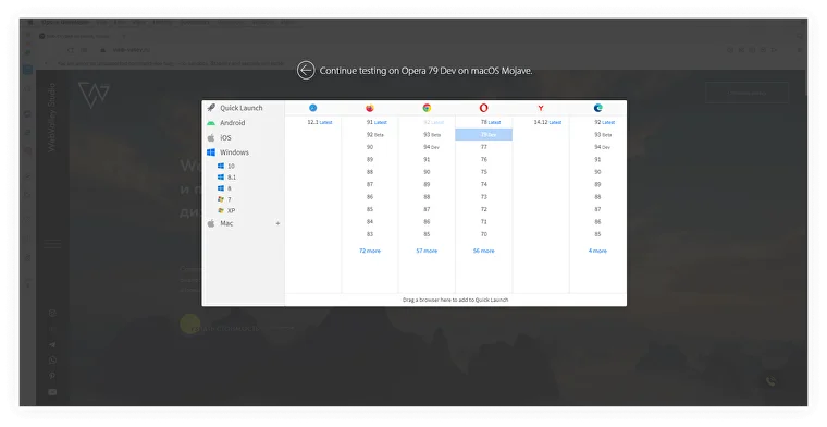

Convenience of cross-browser testing services also lies in their ability to test the website on different versions of the same browser, which can be time-consuming when done manually.
Cross-platform compatibility
The website should display correctly on different operating systems: Windows, Mac, Android, iOS, Linux. Each platform renders fonts differently, supports or doesn’t support certain image formats, and perceives scripts differently.
Markup validity
Validity is a broad concept, but in simple terms, it refers to the absence of errors in the code. All code elements should be placed in their appropriate sections, all opening tags should be closed, and syntax should be followed, including quotes and spacing. Most code editors highlight such errors.
Validator programs, such as W3C Validator, are used to check code validity.
Today, browsers have learned to correct (or rather ignore) minor errors made by developers, but code validity is still an important requirement for SEO optimization. Code errors are perceived by search engine bots as a sign of poor quality, which can lower the website’s ranking.
Pixel Perfect
Pixel Perfect is a technique that ensures 100% fidelity to the design, pixel by pixel. The rendered page should match the design completely, including font sizes, images, margins, line spacing, colors, border radii, and more.
Eyeballing the layout leads to an imprecise appearance of the page. It may seem that users won’t notice a 1-2 pixel difference in the height of elements. Perhaps that’s true, but it will leave them with a feeling that something is off with the website. They may not pinpoint the exact issue, but the overall impression will be compromised. Additionally, unnecessary pixels can cause layout inconsistencies in responsive design.
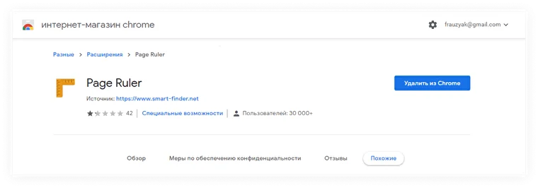
Specialized services are used to test the website’s adherence to the design. These can be programs with simple functionality, resembling rulers, such as Page Ruler for Google Chrome.



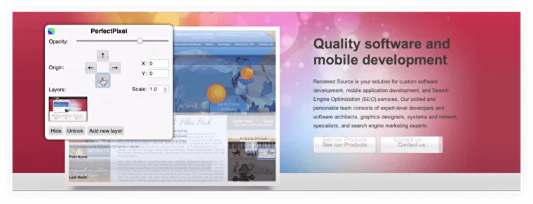
And there are services that can overlay a finished website on top of a design mockup, like tracing paper, to check for alignment. For example, the PerfectPixel extension for Google Chrome is a great tool for this.

Good Code
Well-formatted code is good practice for a web developer. The computer doesn’t care whether the code is written in a single line or neatly divided into meaningful blocks with proper indentation that reflects the nesting.
However, humans will be working with this code, so leaving a mess of attributes, styles, and tags is unprofessional.
Example of poorly formatted code:
<form><label>Phone Number</label><input type="text" value="" /> <button class="button_red"><b>Request Callback</b></button></form> Beautifully written code: <form> <label>Phone Number</label> <input type="text" value="" /> <button class="button_red"> <b>Request Callback</b> </button> </form>
Code can be compressed into a single line using special services, but this should only be done for working, production versions of the website when maximum speed is required.
